A Life in the Day of Hasmok Mehta - Short documentary film
(Creating video mood through Colour)
In the beginning of 'Set Brief Production' short documentary exercise all production team was required to show skills in creating 5 minutes 'Life in the day' of an individual film. It was designed to realise what can be filmed and indicate it with combining narration and interview material. Moreover, all teams were supposed to aim their mood, sound, nature, relationship with character and dramatic tensions within the film.
During this project I faced many issues of showing our main character's personality. Not everyone can be next around the person who is blind. Trying to build strong relationship with the character required passion, developing the sense of his life, exploring new world of a person who has no sight.
I knew that our goal should be to create sad mood in a short film. In this case, colour, space and music will give big advantages for this project. What strategy you should use to set that emotion in a video? Colour and sound can achieve that result. To produce a peace of colour and sound can hit the viewers' feelings. In this case, I was trying different techniques which can increase sad motions in the film scenes. I was inspired by Director: Lucy Walker in his film "BlindSight" in which he shows different colour space and really puts attention in details.
After filming I decided to make a few different short clips with applying various colour styles which will allow me to increase strong mood in a short documentary film. Examples will demonstrate how I have pursued the result and compared the success in the scenes.


These are the original pictures from the captured footage. It presents natural colours and light.

(No colour correction)
"Mojo" film style that I decided to use quickly
delivers the subtle colouring effect in a short documentary, warming up actors’
skin tones while adding a cool blue to backgrounds and shadows. The trick is to
keep your talent in focus beneath the colour treatment, and "Mojo"
does this with simple sliders that add drama and smooth contrast to any shot.
The main "Mojo" slider cools shadows and warms
highlights at the same time. A hint of "Mojo" might make your talent
stand out against the background more.


(Colour Corrected - Current)
To use the monochrome colour space I was inspired by the main actor. During the interview he mentioned that even though he is blind he can still see fragments in black and white colour. I tried to produce a similar looking style in a film which provides audience the feel and mood of the main character.


(Colour Corrected - Example)
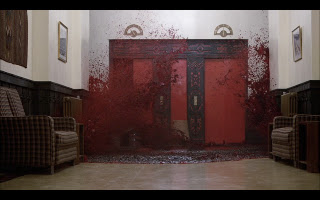
Red, Orange, Yellow are warm colours and the purpose of it is to evoke feeling of happiness, energy and optimism. But as we already know we are not trying to create a powerful or dangerous short film.


(Colour Corrected - Example)
With the above pictures, I pay more attention to colour decisions for video content. It is amazing to experiment but at the same time using colour gives possibility to ruin a piece and turn the audience off. Testing and understanding different options can make sure that piece is fulfilling what is trying to be achieved.


