Stanley Kubrick used colours as symbols as they created a very strong impact on film's atmosphere and emotions experienced by the viewer.
Red is the most dominant colour in "The Shining" and is seen in all the main scenes. Using red colour builds up feelings of danger, evokes anxiety and naturally indicates violence and hate - a horrific experience for a viewer created by masterful colour and lighting.
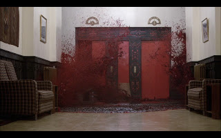
Red colour in the film shows aggression and power. Stanley Kubrick's sets are well lit and it creates dramatic effects combined with vividly coloured sets. For example this scene shows an extremely bright colours and sets a calm yet scary atmosphere - it shows the power of colours effect on emotions.
I learned that in order to create a powerful horror atmosphere I would not necessary need to use the typical dark shots but but do the opposite - created intense atmosphere showing character's inner mind's tension and insanity - horror of the mind.

Dark red colour is used in actors costumes and sets, it sends the audience a clear message about film's main character's intentions - murder. In the screenshot below we see red colour in interior and actors' outfit.

These examples prove me how using colour helps to define film's characters, themes. Nothing is an accident but a precise planned visual storytelling.

Blue colour is also important in the film and indicates moments of loneliness, coldness.
Blue and red gives a contrast for different shots and sets up a completely different atmosphere.

No comments:
Post a Comment